Logo for motorcycle apparel company.
Client wanted a masculine logo that was only lettered based and that would communicate movement and motors.


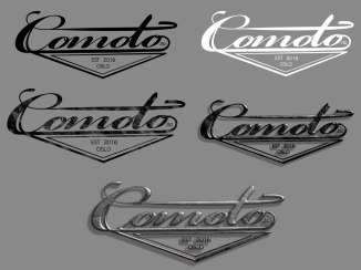

Comoto logo

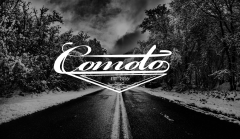
Logo for motorcycle apparel company.
Client wanted a masculine logo that was only lettered based and that would communicate movement and motors.
Comoto logo
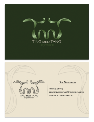
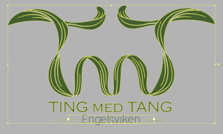
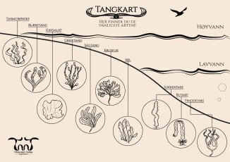
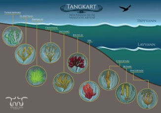
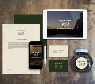 Ting med Tang is a Norwegian company focused on promoting knowledge and use of sea weed. They arrange courses, cooking classes and excursions by the coast of Engelsviken.
Client was looking for a organic nature based look that would give the feel of nature, sea, the Norwegian coast and seaweed.
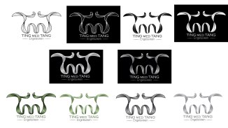
Organic earthy colors was used for the logo. The lettering consists of a piece of seaweed that is flowing in the water and spells out the letters TMT.

Cooking using seaweed


logo
 This was a competition entry for a new wine label and logo. Keywords were: siren, mermaid, feminine, figure, classic. I attempted to make a logo that represented classy feminine curves without being too raunchy. I wanted to make a abstract design that still resembled a mermaid without using too much detail. the label was only a mock up to show how the logo would look like on a bottle.
Logo has later been sold to a osmetics company.

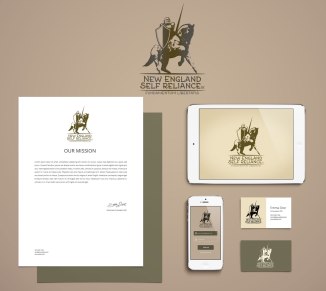
Knight logo
New logo for a website dedicated to to showcase products made by smaller companies from the Americas and Europe that make people less reliant on government and big corporations.
Inspiration for the logo is based on Vytis a king knight from Lithuania. Logo is meant to convey the idea of independence, strenght and resistance.
Decided to let the leaf go for the final version as it gave it a cleaner look.
