Poster and CD cover for the Oslo based rap group Herreløse an their Viking tune.

Work was mostly done as a digital painting i Photoshop using icy artic colors.
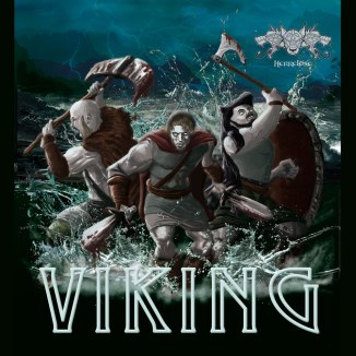

Viking poster


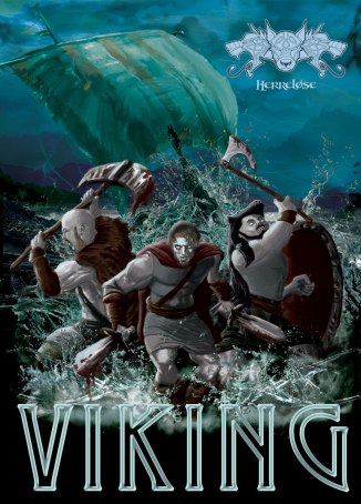
Poster and CD cover for the Oslo based rap group Herreløse an their Viking tune.
Work was mostly done as a digital painting i Photoshop using icy artic colors.
Viking poster
Film is a video diary perspective from the life of a heroin user in Oslo.
Magnus Lilleberg takes you on a intimate journey into his everyday life as a heroin addict in the capital of Norway. He films himself with his hand-held camera and he describes a tough reality without demanding compassion in return.
Poster was created using a mixture of photo manipulation and digital painting in Photoshop.
Font for the Title «Magnus» is created from Magnus Lillebergs own handwritten signature.
The buildings depicted on the poster are taken from areas in Oslo were Magnus and other addicts usually meet.

First rough sketch of Magnus in Oslo

alternative with clean background

Spring color palette
Nico D is a french/norwegian reggae artist based in Oslo Norway.
I wanted to make a cover that represented the mix-tape and his background.
The layout shows 4 turntables that feed into a mixtape at the bottom. On the top 2 turntables there are 2 icons depicted to represent the artists roots. The holmenkollen ski jump in Oslo and the eifel tower in paris.
The overall layout builds on text over the portrait that resembles a crown and design elements around the portrait that are influenced by africa, reggae and music in general.


Mix tape coverart

Mixtape cover alt version
After sketching I layed out the design in illustrator.
Finally I did the finnishing touches in photoshop to give the artwork a worn down/rusty look.
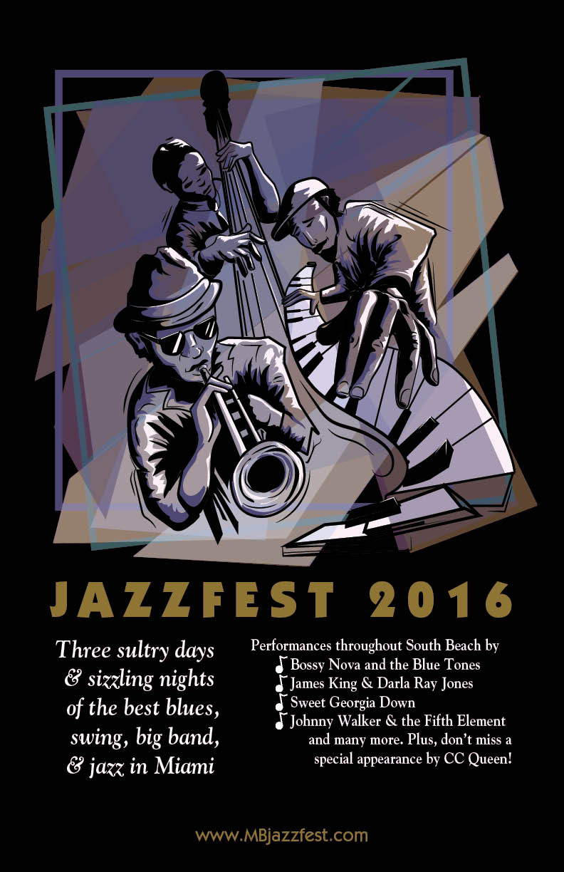 For this project I wanted to create a basic Layout with a eyecatching illustration that represented Jazz visually, with sombre relaxing colors and a dynamic figurative abstract feel to it.
 First sketch with pencil.
 Vector artwork in Illustrator.
For the characters I only used solid black and Purple to highlight the main features.
Background is made up of several transparent irregular shapes to give a dynamic feel that moves in the opposite direction of the musicians. This helped gain the Jazzy feel I was lookng for.
 Finally I added the illustration from illiustrator to a basic layout in indesign to get correct allignment for the text and imagery. From Indesign the poster is prepared for print with the correct values of bleed and colors.
 A Poster for a humanitarian cause.

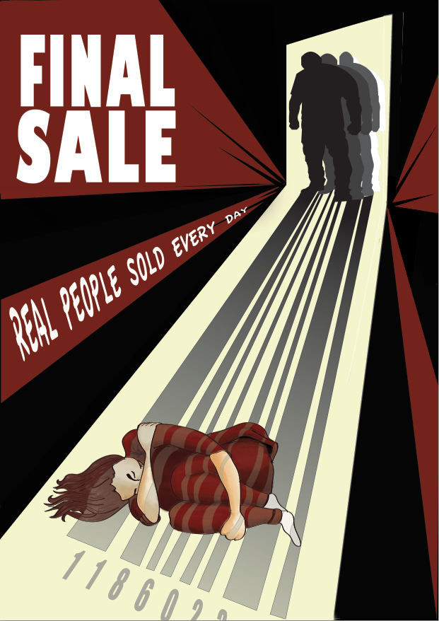
 Poster to create awareness against human trafficking.
The Poster is inspired by propaganda posters from the modernist era put in a contemporary context.
Poster to create awareness against human trafficking.
The Poster is inspired by propaganda posters from the modernist era put in a contemporary context.


logo
 This was a competition entry for a new wine label and logo. Keywords were: siren, mermaid, feminine, figure, classic. I attempted to make a logo that represented classy feminine curves without being too raunchy. I wanted to make a abstract design that still resembled a mermaid without using too much detail. the label was only a mock up to show how the logo would look like on a bottle.
Logo has later been sold to a osmetics company.

Knight logo
New logo for a website dedicated to to showcase products made by smaller companies from the Americas and Europe that make people less reliant on government and big corporations.
Inspiration for the logo is based on Vytis a king knight from Lithuania. Logo is meant to convey the idea of independence, strenght and resistance.
Decided to let the leaf go for the final version as it gave it a cleaner look.

Ghostbuster-Back to the future mashup-

Commission T-shirt design.
Only instruction given was to make a mash-up of two iconic 80’s movies.
Doc and Morty dressed up as ghostbusters with marshmallow man and the Delorean.
Vector art created in Illustrator. Used a pyramid type design for the composition and as few colors as possible without loosing imagery to make it easily printable.
Til å begynne med var det svært frustrerende å komme på noe konkret som jeg kunne begynne å videreutvikle.
Selveste oppgave teksten er ganske abstrakt og kan omfatte nesten hva som helst.
Jeg tolket oppgaven ved å se for meg en reise som enten var 1 cm lang eller omfattet små dyr eller begge deler.
Utifra dette ønsket jeg å lage en illustrasjon eller en informasjons plakat.
Illustrasjonen skulle formidle noe gjennom en reise.
Ettersom oppgaveteksten var litt abstrakt så ville det også passe med en abstrakt eller surrealistisk produksjon.
Budskap
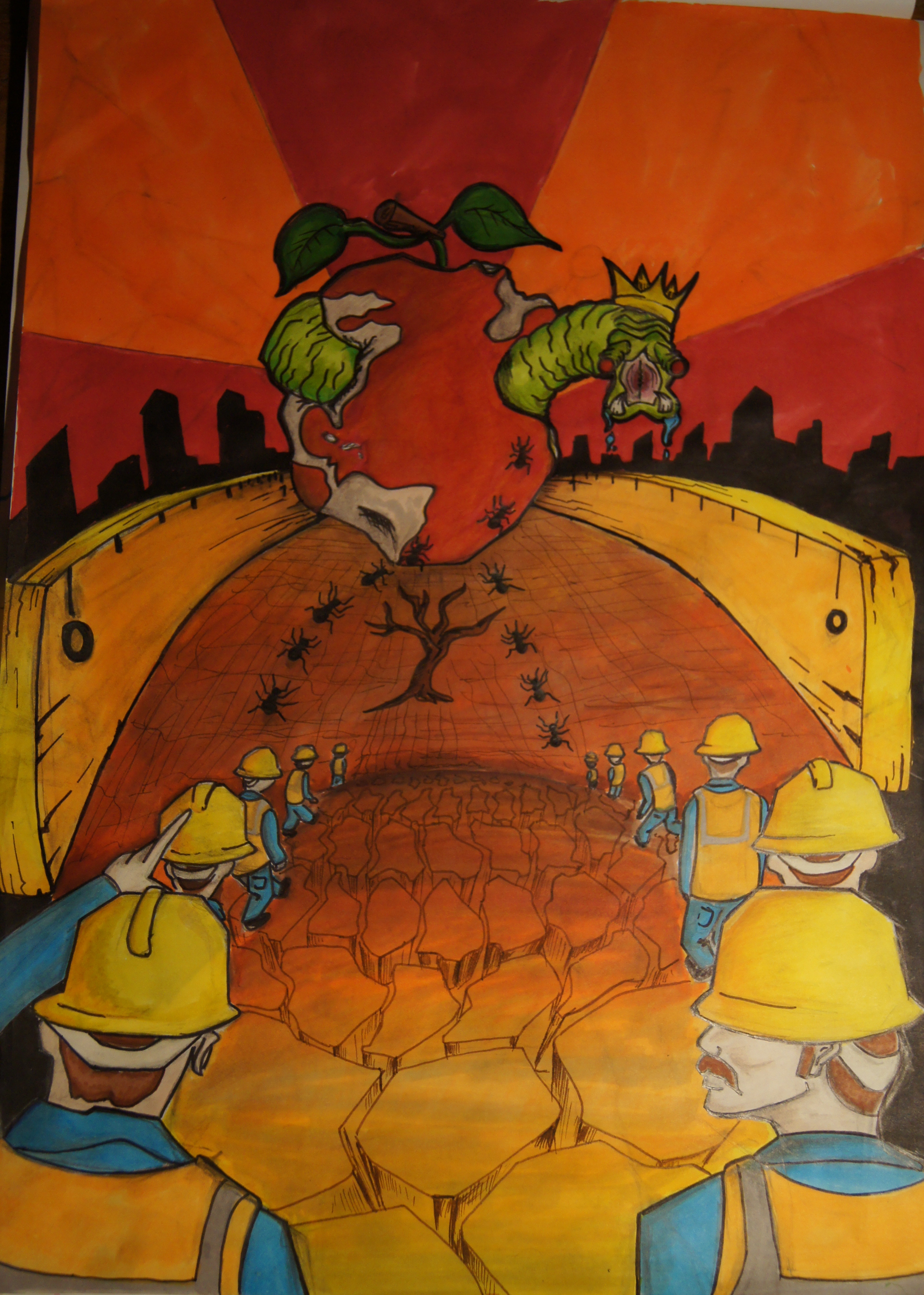
Eplet skal forestille jorden som blir spist opp av en Larve .
Larven er egosentrisk og grådig. Den fortærer alt uten hensyn til andre i samfunnet i likhet med verdens topp 1% som styrer og fortærer alt.
Maurerne og arbeiderne er de som blir tråkket ned på av de rikeste i samfunnet . De må samarbeide for å få en del av ressursene som finnes igjen .
Arbeideren og Maurene er en og samme.
For å søke etter mer inspirasjon begynte jeg å se en del på surrealistiske bilder og konstruktivisme arbeid fra tidlig 1900 tallet. Jeg likte spesielt gamle propaganda plakater fra kommunismen.
Konstruktivismen har en fin måte å formidle en presis budskap med en ganske tøff stiluttrykk.
Jeg ønsket derfor å prøve å bruke en surrealistisk stil med et tema fra konstruktivismen.
Etter dette dannet jeg et bilde i hode av hva jeg skulle ha.
Jeg ønsket å ha arbeidere som startet ut på en reise for å deretter bli framstilt som maur som skulle kjempe mot en enorm larve som fortærer kloden.
Siden dette skulle også være en smule surrealistisk ville ikke skala spille noen rolle.
Hele reisen skulle foregå inne i en cm.


